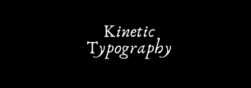

Imagine words dancing on your screen. Well, that’s the magic of kinetic typography.
Making words move is like choreographing a dance. It’s like turning your everyday sentences into a cool stage performance.
Let’s take a closer look at the dancing world of words and see how they bring words to life.
What is kinetic typography?
Kinetic typography, in simple terms, is the art of making words move however you like. It’s not just about reading; it’s about watching words twirl and spin, making your messages more exciting.
Or, in general, moving words with a touch of creativity.
It is an art form that leaves a lasting impact on the viewer. You can see this moving text in films, commercials, and music videos.
A brief intro about typography art
Kinetic typography is not new.
In the ever-evolving landscape of visual communication, one innovation stands out as a dynamic force that brings words to life. This is kinetic typography.
Traditionally, words were confined to their static existence, limited to the constraints of paper or screens.
Kinetic typography liberates them, breaking the shackles of stillness and allowing them to transform dynamically. This art form opens doors to creativity and innovation.
The roots of kinetic typography can be traced back to the early 20th century when experimental filmmakers sought to break free from the constraints of static text.
Pioneers like Dziga Vertov explored the potential of incorporating moving words into their cinematic works.
How technology became a turning point for this art form
As technology advanced, so did the possibilities for kinetic typography. In the earlier era, designers and filmmakers relied on intricate techniques.
It included stop-motion animation to imbue the text with movement.
The advent of computers and digital technology in the latter half of the 20th century marked a turning point for kinetic typography.
Designers then had powerful tools at their disposal, allowing them to experiment with motion, timing, and typography in ways previously unimaginable.

Leading to an animated text
With the rise of the internet in the late 20th century, kinetic typography found a new playground. Flash animations and web design allowed for interactive and animated text, creating a dynamic online experience.
Today, typography art has become a mainstream form of visual expression.
From advertisements and social media content to educational videos and cinematic productions, moving text is seamlessly integrated into our daily visual experiences.
But today, we can see kinetic typography everywhere, from designers using it to capture the audience’s attention to a website’s graphics and commercials.
Why use kinetic typography
In the dynamic realm of visual communication, kinetic typography emerges as a powerful tool, breathing life into static text.
Here are a few reasons why you should embrace the magic of this art form:
Captivating communication
From plain to playful, it will transform the traditional text into a dynamic, engaging experience.
It captures attention by adding movement and visual interest, turning a plain message into a captivating one.
Expressive storytelling
“Words have the power to invoke an emotional response“.
Words alone can convey meaning, but kinetic typography elevates them to tell stories with emotion.
The movement, pacing, and style create a narrative that resonates with the audience on a deeper level.
Visual appeal
“Enhancing the visual appeal of your content”.
It’s not just about what you say but also how you present it. The combination of motion, fonts, and colors makes your message visually appealing and memorable.
Educational enhancement
In educational settings, kinetic typography is a game-changer.
It makes learning more enjoyable and effective by turning information into a visually stimulating experience. Complex concepts become more accessible and memorable.
Branding impact
“Establishing a distinctive brand voice”.
It takes brand messages beyond the static, making them more memorable and leaving a lasting impression on the audience.
Increased engagement
“In a world filled with distractions, holding the audience’s attention is crucial“.
Kinetic typography does just that. The dynamic nature of moving text keeps viewers engaged, preventing information from becoming overlooked or forgotten.
Modern and trendy
The typography art aligns with modern trends in design and content creation. We believe colors can make words more exciting.
Its adoption reflects a commitment to staying current and resonating with audiences accustomed to dynamic and visually appealing content.
Versatile applications
“Kinetic typography isn’t confined to digital screens: it is beyond screens”.
It seamlessly integrates into various mediums, including presentations, advertisements, educational videos, and even live events.
Its versatility makes it a valuable asset across diverse platforms.

Bringing text to life with motion
The story of moving words!
The dynamic art form infuses motion into letters and phrases. This creative form narrates stories by adding movement.
As we look back at how moving words started, it’s cool to see how they became a big part of movies, ads, and even education. Imagine learning math with words that dance—it’s way more fun!
Whether it’s the gentle fade-in of a sentence or the dramatic entrance of a key phrase, motion adds layers of meaning and emotion to otherwise static text.
Much like music, kinetic typography has rhythm. It’s not just about what the words say but also about how they move. The pacing, timing, and flow create a visual melody that resonates with the audience, turning a mere collection of letters into a rhythmic dance.
Talking with an emotion
Kinetic typography isn’t just about making things look pretty; it helps express emotions. Your words become more than just letters. They become an experience.

Grabbing attention
In a world where everyone is busy, typography is like turning on a spotlight. It helps you catch people’s attention and make your message unforgettable.
It caters for all. Here is how:
- For Educational Purposes:
For students and workers, kinetic typography isn’t just a fancy trick; it’s a helpful tool. It makes learning and presenting information way more interesting.
- For Brands and Ads:
Big brands use typography to make their messages pop. It’s like giving words a makeover, making them more exciting and fun to watch.

Examples of typography
Typography, the art and technique of arranging text, comes in various styles and forms. Here are some examples of different typography styles.
Now, you don’t need to be a tech whiz to make words move. From picking cool fonts to making words move in patterns, these tools make it fun and simple.
Choosing different fonts can make your words look cool. It’s like picking outfits for your words.
Morphing
Morphing typography is the most used technique to create motion typography. It is simple and eye-catching.
Flickering
flickering is the one that is fun to work with but you will not find this very often. It is the rapid change in the visibility of text elements.
Hypnotizing text
Hypnitizing text this one always stands out and leaves audiences amazed.
Moving text
Moving text is from right to left or from top to bottom.
Geometric constructions
Geometric constrtctions is a pattern between lines and surfaces making it look cool.
Fluid geometry
Fluid geometry is a typography animation technique full of urban air and fluid dynamism. The text scales automatically with the screen size.
Neon flickering
In neon flickering you will find this type of typography in fun places. It adds a nostalgic and vintage vibe to videos.
Tips for applying kinetic typography to engage with audiences
Typography is a versatile way to draw attention.
- The font must represent a polished look. So, opt for an easy yet professional font to help people remember visual content.
- Use orientation and experiment with constant motion to grab attention to words and phrases.
- Keep the flow of content and typography in mind. The movement of words must be consistent throughout the visuals.
Typography: embracing technological trends
The future of moving words.
What’s next for kinetic typography? Well, things are getting even more exciting! Imagine wearing special glasses and seeing words dance around you—that’s the future.
Mixing technology with words is going to change how stories are told.
As technology evolves, so does kinetic typography. It aligns with the trajectory of augmented reality (AR) and virtual reality (VR).
It promises immersive experiences where words become three-dimensional elements, evolving storytelling into new dimensions.
Wrapping it up, kinetic typography isn’t merely a design choice; it’s a dynamic language that adds depth, emotion, and vibrancy to your words.
Whether you’re conveying a message, telling a story, or educating, kinetic typography emerges as a compelling choice for those who seek to amplify the impact of their words in the visual landscape.

Final thoughts
The history of kinetic typography is a tale of innovation, experimentation, and adaptation.
In the world of typography art, where words become a performance, the journey is like an adventure. From picking fun fonts to making words dance, each step is a chance to be creative.
We believe kinetic typography must be implemented carefully.
So, are you ready to make your words dance? Dive into the world of kinetic typography, where words go from boring to spectacular.
Let your words have a party, and may your journey into moving text be as fun as the words themselves!